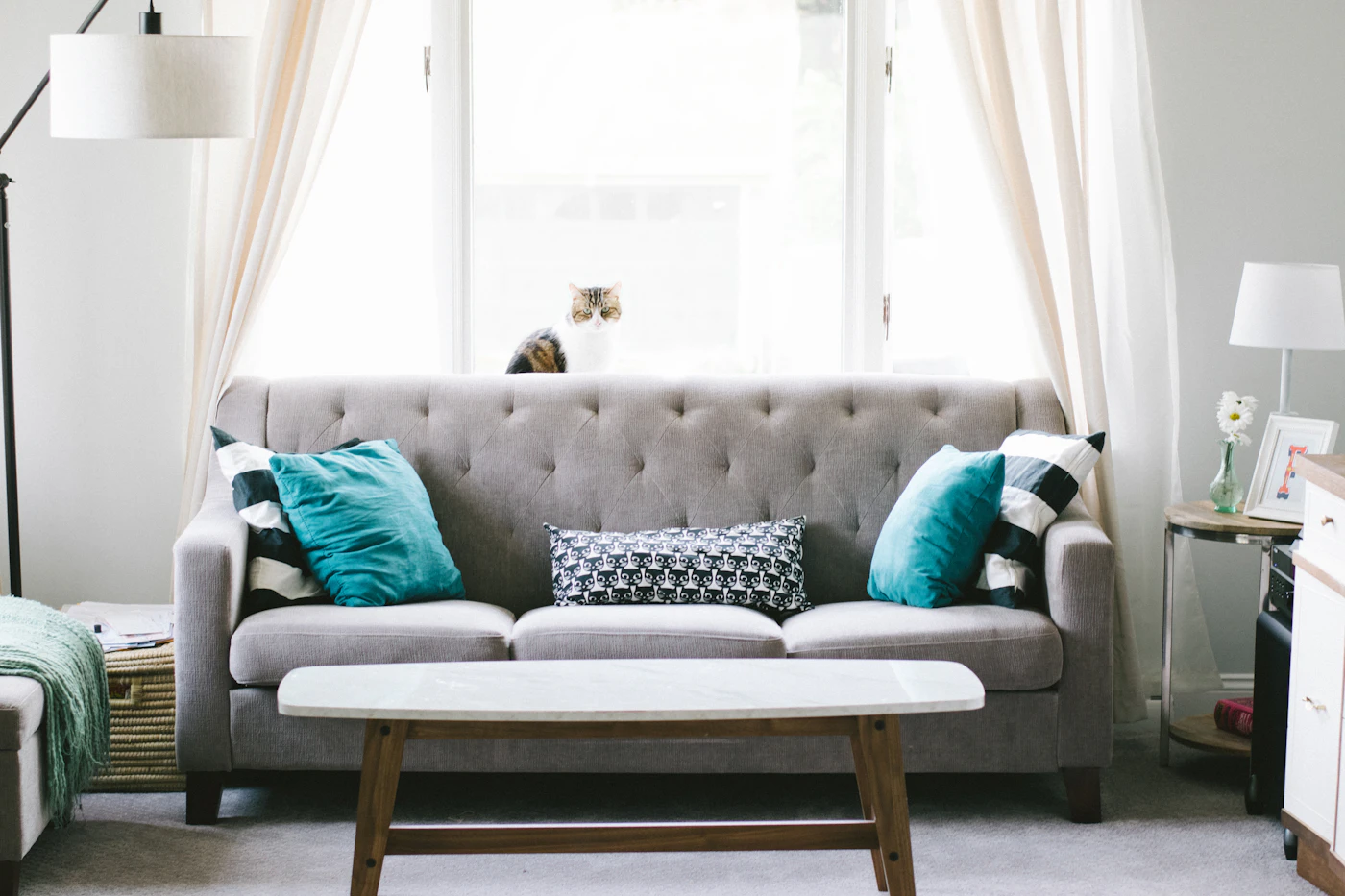
A familiar sofa can look different when one textile moves beside it. Begin with an owned cushion cover or throw whose ordinary use and care you understand. The point is to observe a colour relationship in the room you already have, rather than turn a photograph of blue-green cushions on a grey sofa into a complete shopping list. A small comparison can reveal which part of the arrangement actually interests you.
Start with the sofa as it is
Look at the sofa without adding several trial objects at once. Notice its visible colour beside the wall, floor and nearby furniture. These large areas remain part of the composition even when a close photograph crops them away.
Choose a textile that is available for this review and suitable for its intended use. Do not borrow an item from an active household arrangement without agreement. The comparison should not create an unexplained gap elsewhere simply to improve one view.
Change one area of colour
Place the textile in a normal, supported position appropriate to the item. Compare a small visible area with a broader one, such as a folded throw compared with the same throw spread more openly. Keep the arrangement practical for the furniture and textile.
Describe what changes. A little blue-green may echo something already in the room, while a larger area can become the dominant feature. Neither result is a universal rule. It tells you about the particular size and surroundings in this comparison.
Keep pattern and texture distinguishable
If the trial textile has a pattern, identify whether it is the colour or the repeated marks that attract your attention. A plain cushion in a similar colour would not necessarily create the same effect. Likewise, a strongly textured surface can change the impression without adding another hue.
Avoid claiming a material from its look alone. An illustrative photograph can show a ribbed or uneven surface without establishing fibre content. For an actual purchase, read the product's stated composition and care information separately from the visual idea.
Look from the ordinary viewpoints
Review the sofa from the entrance and from the seat normally used across the room. A carefully framed close-up can emphasise a cushion that becomes a very small element in the full space. Keep these observations separate rather than choosing the most flattering photograph as the only verdict.
Observe in the room's ordinary available light, recognising that colour can appear different at other times. A quick phone photograph is a memory aid, not an exact colour sample. If buying later, preserve uncertainty rather than promising a precise match from the screen.
Return or retain deliberately
Return the textile to its proper place if the comparison does not lead anywhere useful. If you keep it beside the sofa, agree that role and preserve the relevant care reference. Record the specific relationship you liked before considering additional items. One thoughtful change may be enough; a styled collection does not oblige the room to acquire every supporting accessory.
Related reading
Black Clothes with More Than One Texture, Colour Confidence: Wear the Bright Thing on an Ordinary Day.
Our approach
Start with what you own, identify a real gap, then compare fit, materials, care and return terms before buying. Availability and prices can change. Read our editorial policy or send a correction.