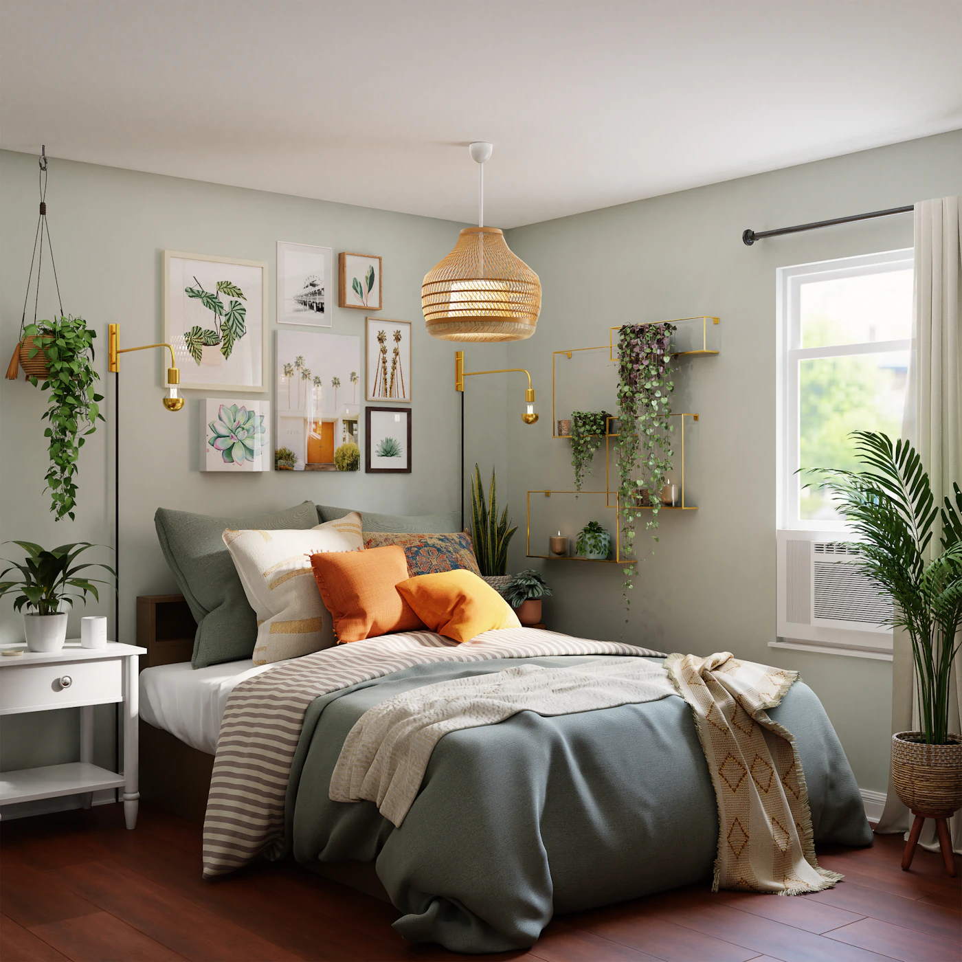
A bedding photograph can make a whole bedroom seem like one colour decision. In a real room, the walls, furniture and ordinary belongings already provide a background. Compare one actual change at a time before planning a coordinated collection. The useful question is which relationship you enjoy in the room you have, not whether every object can be replaced to reproduce a campaign scene.
Name what remains unchanged
Start with the existing wall, bed and furniture arrangement. Keep the product guidance and ordinary room access clear. A new colour idea should not depend on moving every practical object out of the frame permanently.
Identify the part you genuinely want to compare. A main bedding area, a smaller textile or an accent detail can create different visible effects. Keeping the scope modest makes the preference easier to understand.
Use actual owned references first
Where suitable existing pieces are available, compare them in the room rather than relying only on screen swatches. Keep product identity and care information separate from the visual exercise. Similar colours do not establish interchangeable materials or sets.
If the comparison uses a product image, treat it as approximate. Lighting, processing and screens can influence appearance. Do not promise an exact match between unrelated photographs or infer a fibre from a texture visible in the campaign.
Observe the full room relationship
Look from an ordinary distance instead of only at a close fabric crop. A small colour detail that seems dominant on a phone can become modest beside the actual furniture. Notice whether you enjoy that balance before adding more matching pieces.
Keep another owned option available for comparison where appropriate. Changing one textile while leaving the rest stable can reveal more than replacing several objects and then assuming each was needed.
Review practical membership separately
Read what an offered set genuinely includes. Cushions, layers or other decorative items in a styled bedroom may be separate products. Visual coordination should not become an unsupported promise about one purchase.
Do not treat a decorative wish as an automatic household gap. Both appearance and practical need can matter, but they should remain distinct. An existing suitable group may already answer ordinary use while a new colour remains a preference to consider.
Keep the conclusion specific
A private note can name the actual room and colour relationship you liked, preserving the limits of any photographic comparison. Avoid a universal formula about which colours belong in every bedroom. Another space can have a different existing background.
Follow each product's appropriate care and storage guidance after use and keep an active ownership reference accurate if belongings change. A focused colour review lets the furnished room guide the decision, allowing a styled image to inspire without becoming a complete shopping instruction or a promise of identical appearance at home.
Related reading
Black Clothes with More Than One Texture, A Short Note about an Outfit’s Repeated Adjustment.
Our approach
Start with what you own, identify a real gap, then compare fit, materials, care and return terms before buying. Availability and prices can change. Read our editorial policy or send a correction.